Finansia - Stock Brokerage
A Stock Trading Tool for Pro
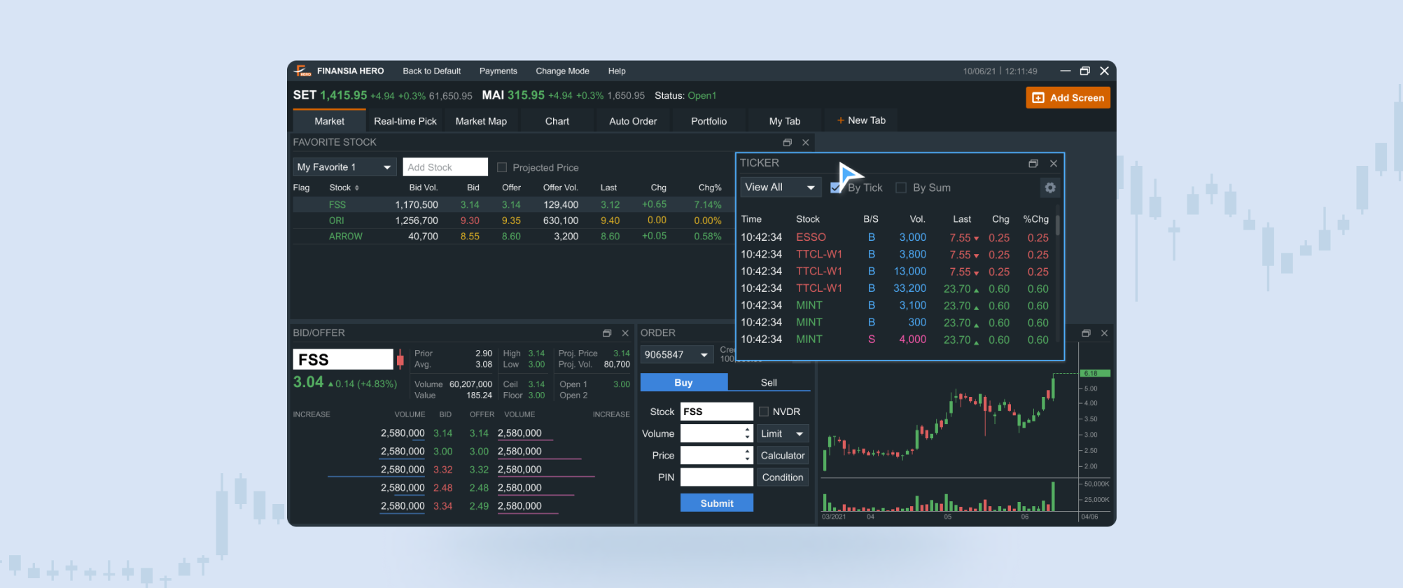
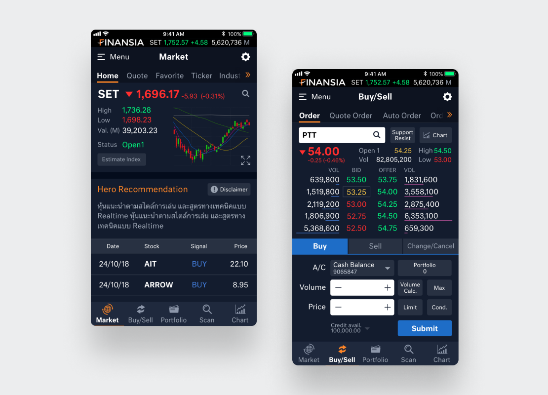
Finansia has a stock trading tool called Finansia Hero. While it was a popular stock analysis tool among Thai traders, but not many people executed orders through the platform. Finansia wanted us to help them identify where users fail and design a new user experience for their PC platform that is more user friendly and increase the number of order.
From Idea to Launch
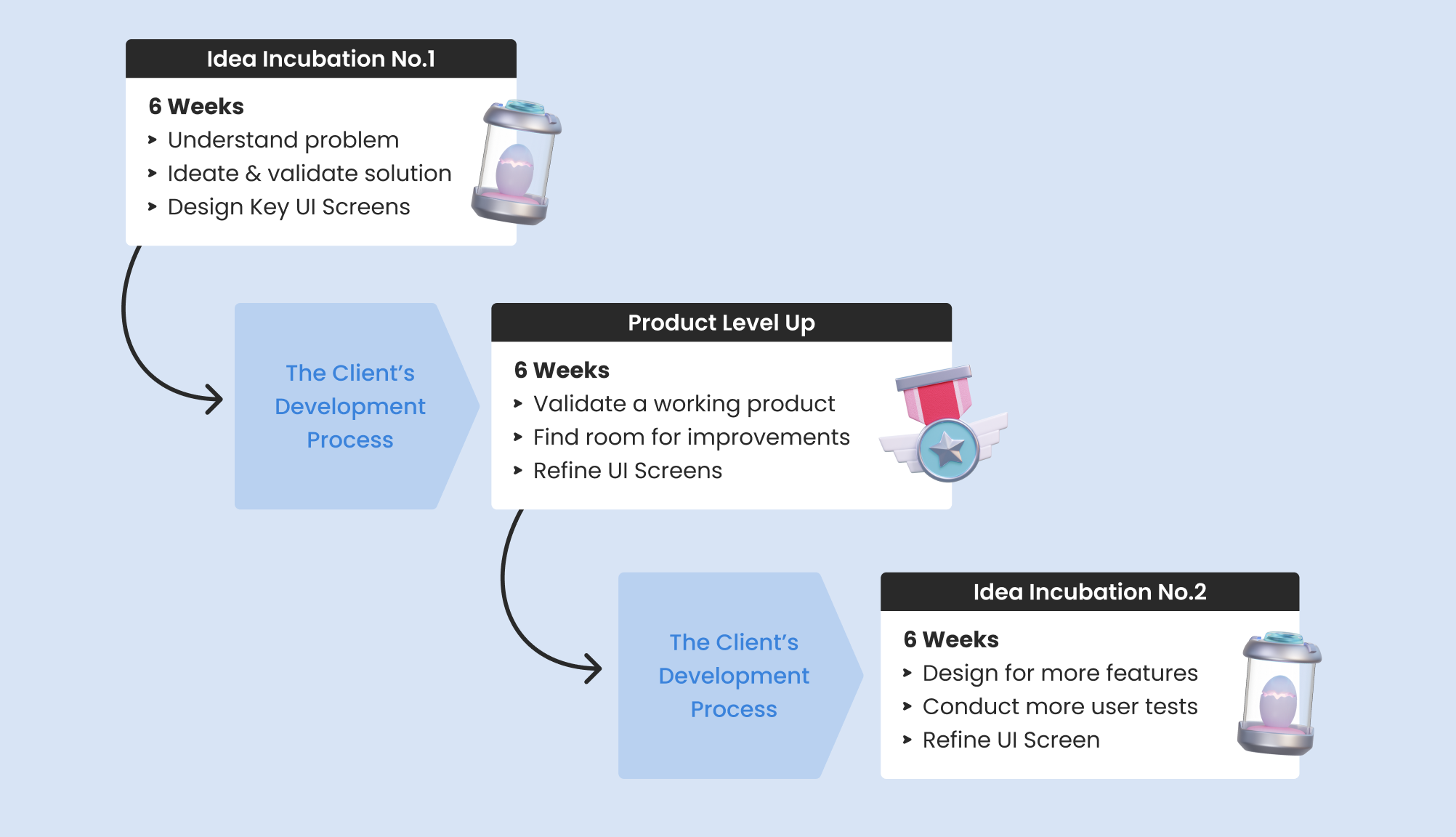
In order to effectively solve the problem, Ahancer Team, Finansia Team, and stock trading instructors work together by utilizing each other's strengths. We work togther in 3 design phases. Each phase uses our 6-Week UX Package to accomplish different goals: understad the context, level up the product, and ideate new features.
Learn from the Users
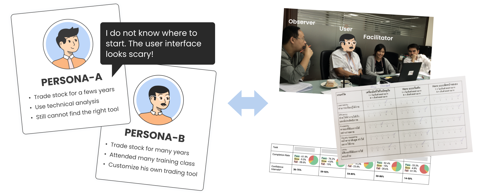
User test and User Interview are the crucial parts of this project. They allow us to quickly learn about the user perspective, the flaws in our design and also experiment ways to find solutions. Together with the Finansia team, we conduct 6 rounds of user test with a total of 90 users.
Define Key Experience
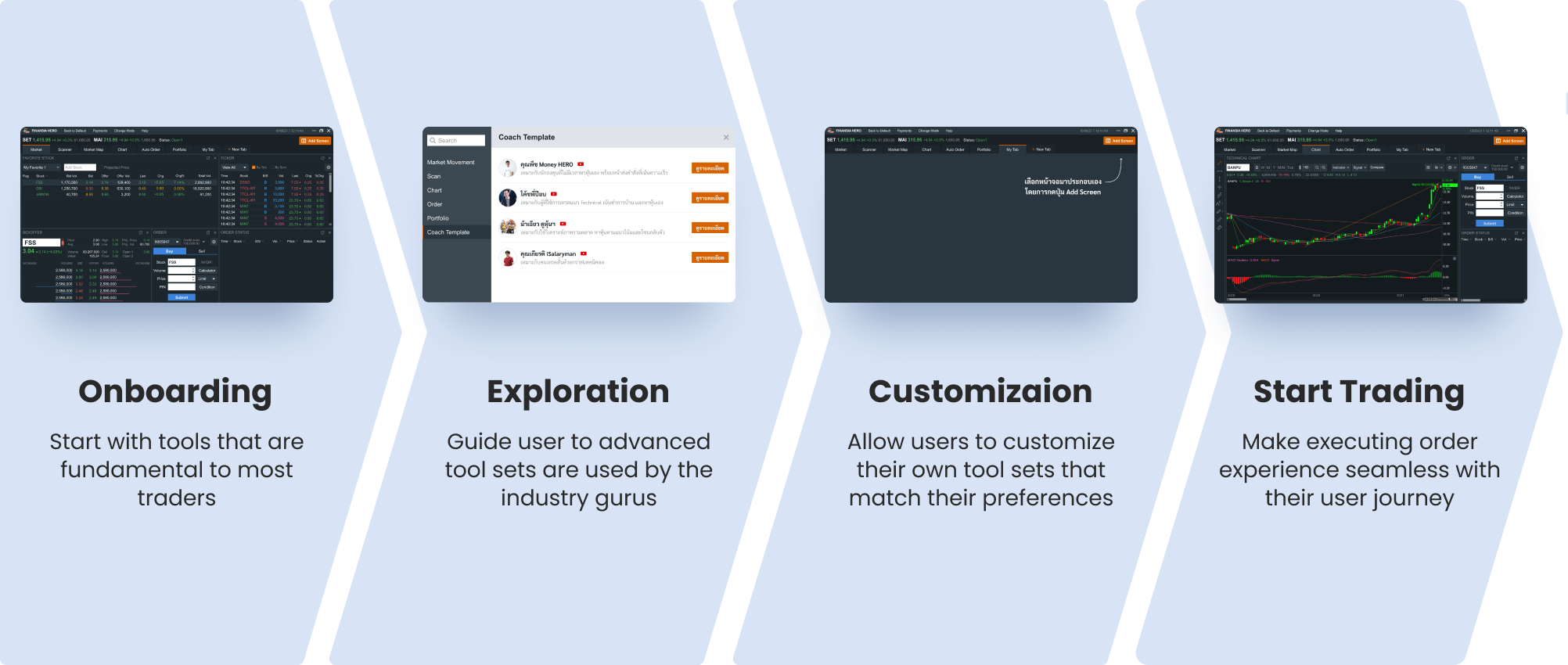
The goal is to make this tool easy to learn and use even for novice traders. Therefore, we provide the users with only tools that enough to create a ready-to-use experience. We create an easy way for them to set up set up their tools to look like ones from the industry gurus. When they become pro traders, they can customize their screens to get more sophisticated experience.
Design User Interface
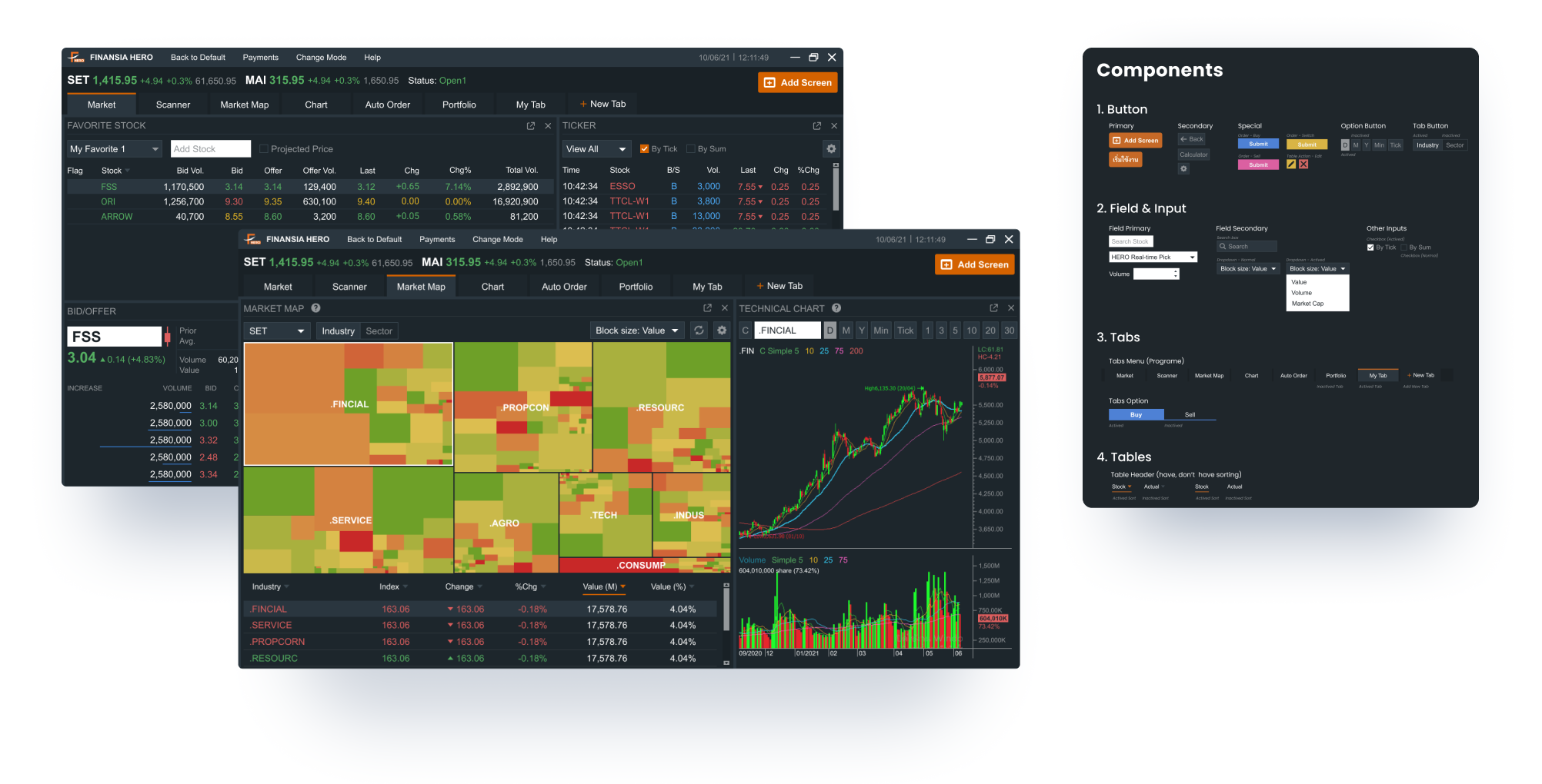
Feedback’s After Launch

Finansia Team
“Less questions from customers because they can understand it by themselve”
“Trainer can easily train customers because the new menu structure is less confusing”
“We receive noticetably more transactions from Auto-Order feature”

Finansia Users
“I can easily complete my tasks in one page. I probably stop using [Competitor Software].”
“The new screens are easier to execute order. I can also rearrange my screens to a way I like it to be.”
“It's much more organized. I like it.”
