Meb - Ebook Platform
A Bookstore for Eveyone
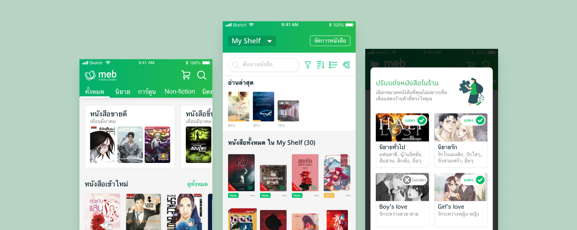
Meb is one of Thailand’s leading ebook company. They wanted to re-design their mobile and tablet application in order to gain traction from new users. However, they also did not want confuse their long time users with the new design. In 2019, Ahancer conducted Discovery and Design process for Meb to help them accomplish their goals.
Discovery
We started our discovery process with user interviews in order to get a clearer picture of who Meb’s core customers were and the pains and gains they had with the past Meb app. Then we used the findings to design new concept and repsent it with wireframe.
1. Understand User

Through interview with book readers and their existing users, we could identify 2 personas whom we called “Loma” and “Wan.” Loma is a new user who cannot find books on Meb because she had a misconception that Meb has only romantic books. Wan is a long time user who is loyal to the brand because of a good customer service that she received.
2. Identify Problem
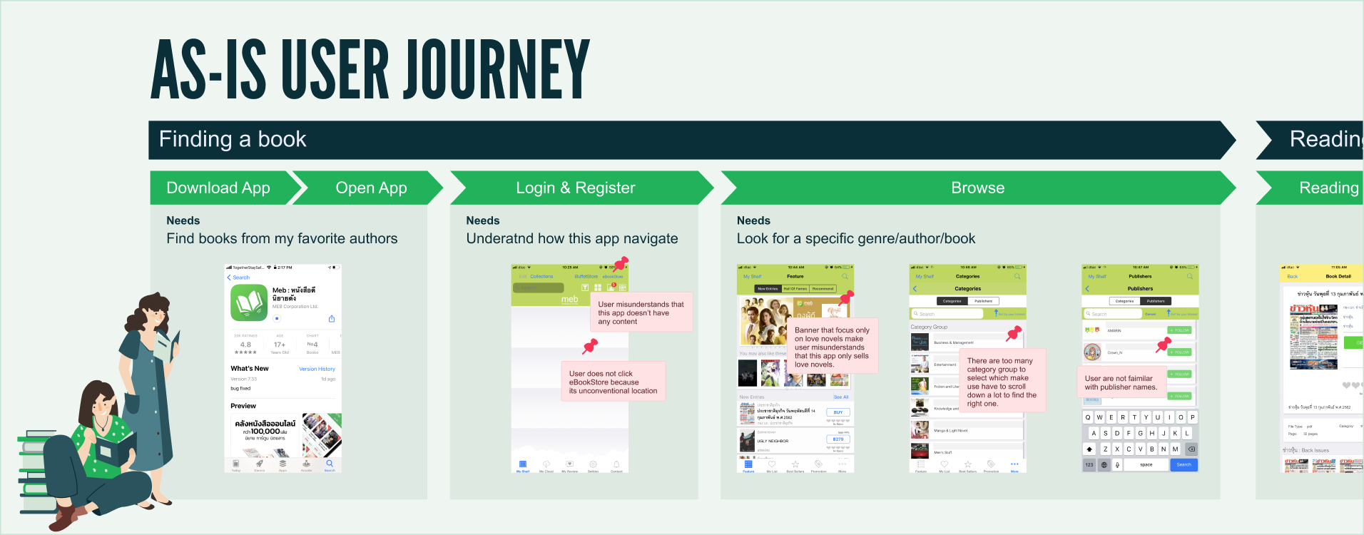
We conducted usability testing with the past application to idenify issues that each persona had. We represented the findings in form of user journey.
3. Define Solution
Make the app easier for new users to find and read books they love while convincing avid readers that the Meb app they love is still here but better?
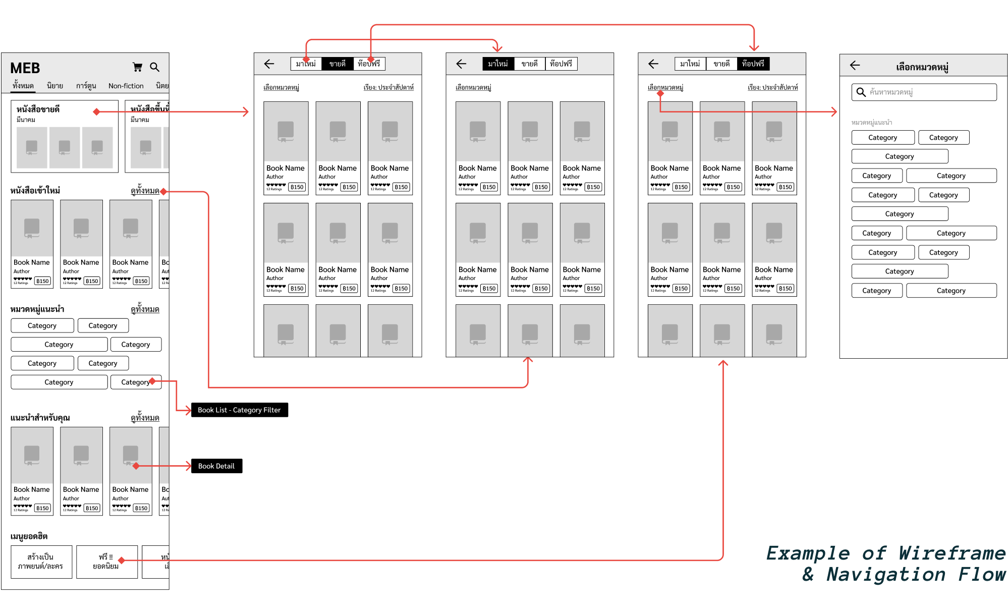
After exploring multiple concepts to enable a better browsing experience, we created low-fidelity wireframes to test with our users. Among the many things we did with our new design some notable changes were onboarding for new users, a top navigation to switch between book types, easy access to best sellers and hall of fames for that book type, and a more streamlined way to browse by category (i.e adventure, fantasy, etc.)
After numerous user tests we were able to refine our wireframe and flow into something Meb’s dev team could be confident in developing in parallel as we began our UI design.
Design
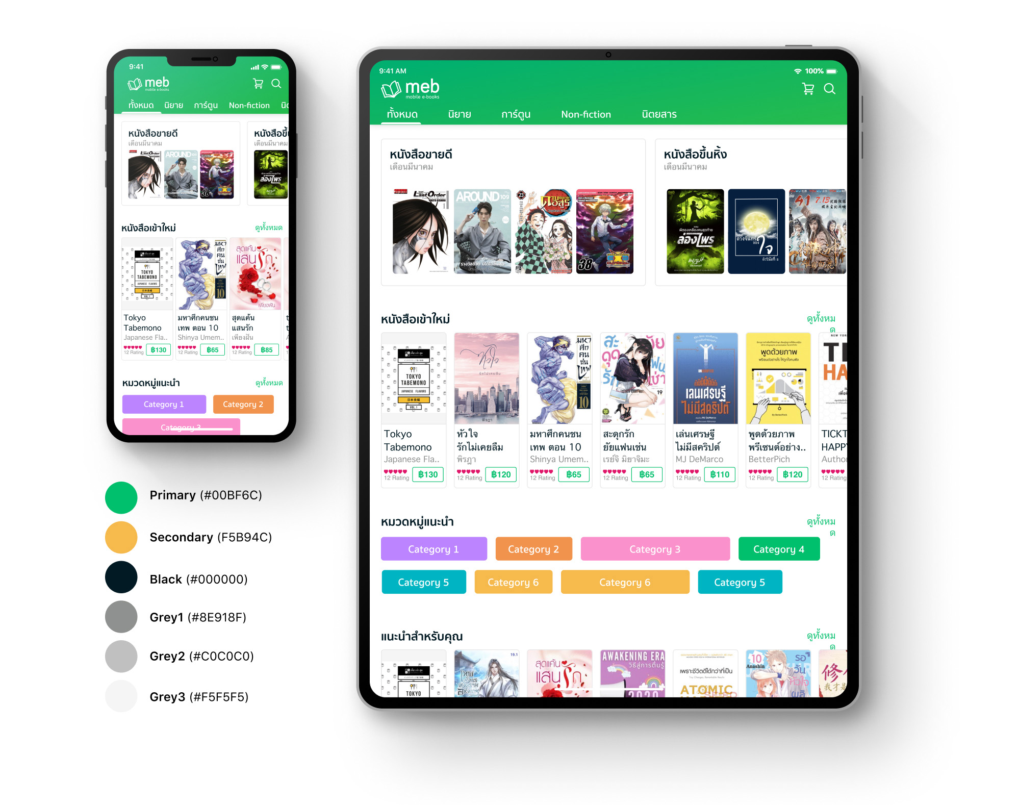
For our UI design we aimed for a modern and clean look that enable the content to shine through, paying special attention to usability over decoration. Besides designing for mobile we also designed for two tablet sizes (a smaller Android device and the iPad size).
Our Finishing Though
We are proud of our work with Meb and grateful to have had the opportunity to work on a product with such a large userbase. This was also the first time we started experimenting with the co-working model with our clients and this have led us on quite a journey.
We didn’t include many UI pics here if you would like to see more please check out the live app in Apple Store or Google Play Store.
