Thai Revenue Department
Make Tax Filing More Friendly
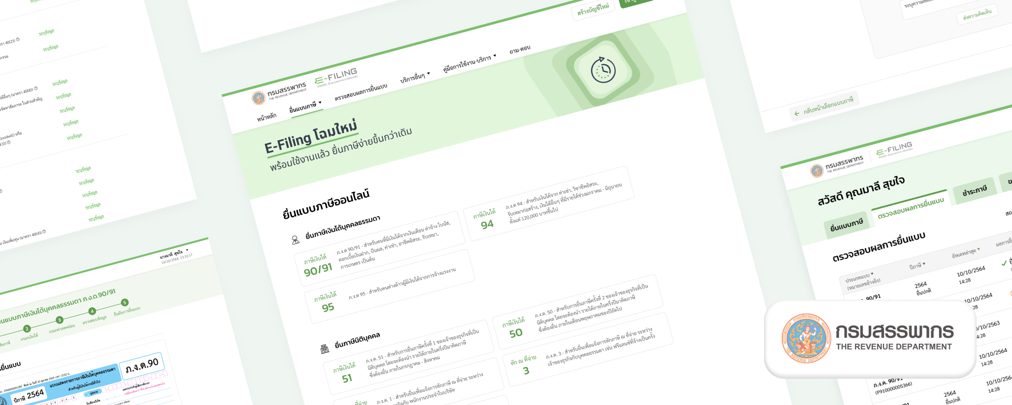
Thai Revenue Department had redesigned their tax e-filing website and wanted to make sure that the new version was easy to use before they released it to the public.
6-Week UX Service
We collaborated with Thai Revenue Department and their IT vendor (PCC) to assess the usability of individual online tax filing and come up with ways to improve the experience in 6 weeks.
- Week 1: Conduct usability testing with participants from all experience levels
- Week 2-3: Create new design and conduct more usability testing with a new group of users
- Week 4-6: Revise design and conduct more usability testing before conclude our suggestions
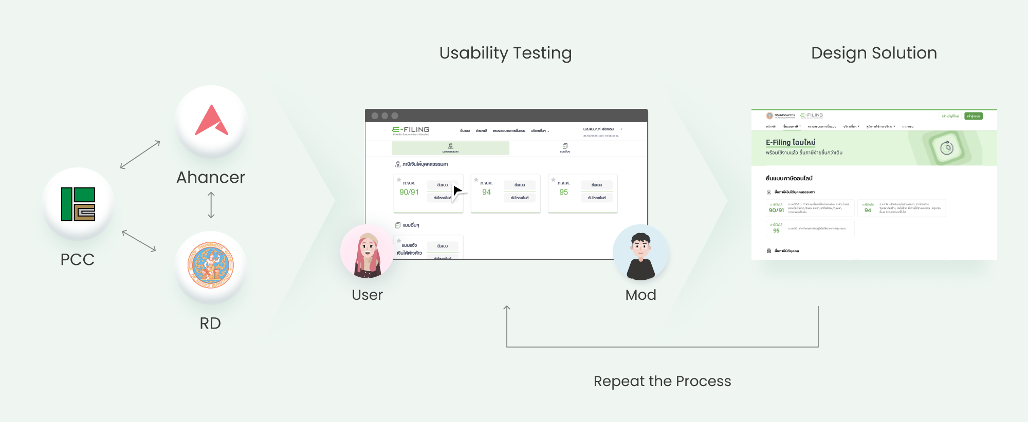
Usability Testing
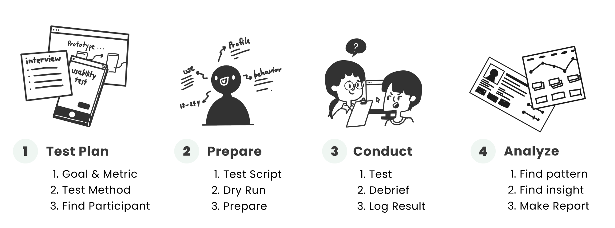
We worked together to create test plan and conducted usability testing to find issues in the e-Filing website. There were total of 22 test sessions conducted by our team.
Test Results & Solutions
The initial test result showed where users needs help when they try to file tax by themselve. The examples of those usability issues were shown in the image below.
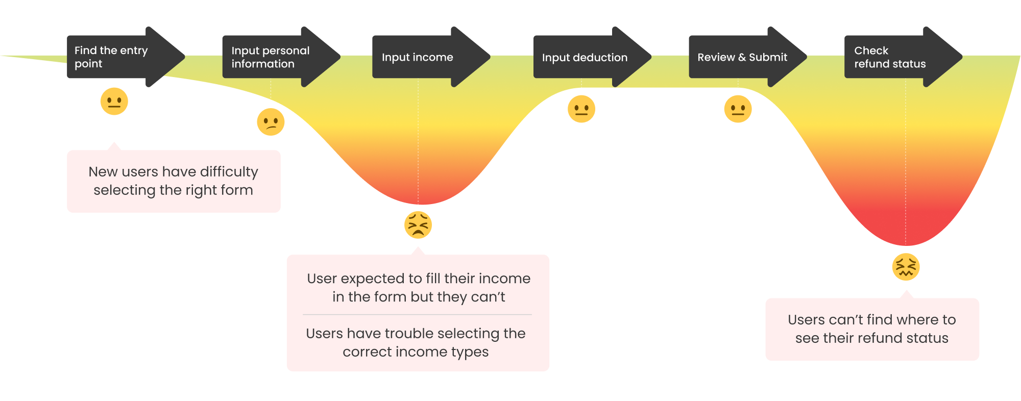
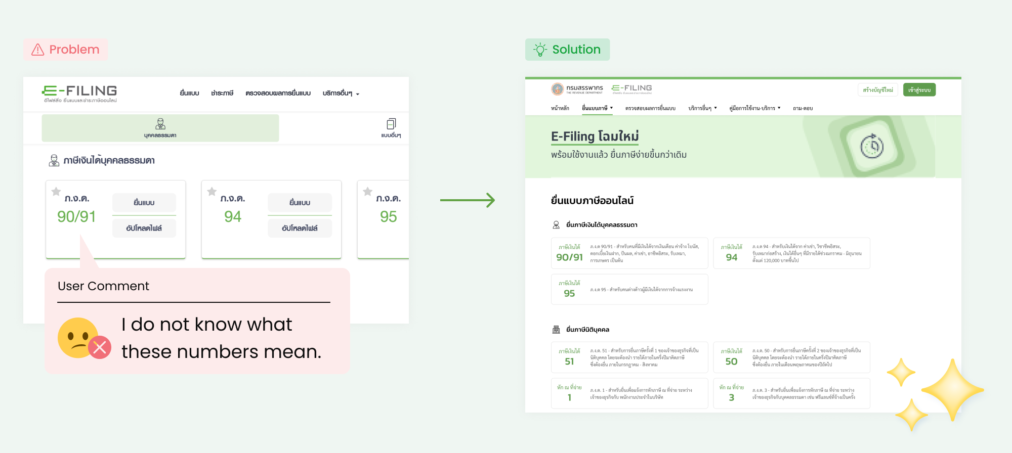
1. Difficult to select the right form
New users have no idea which form they have to select because the form are represented in numbers like (90/91, 94, 95, etc.). We add a clear descript and example to each form label. We keep the form numbers prominent to assist existing users who already familiar with the numbers.
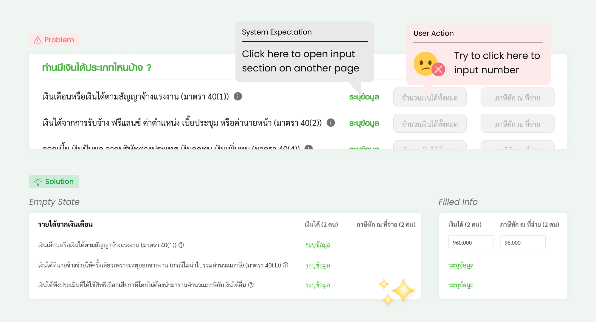
2. Can’t fill in their income
Users do not know that “input” is clickable, so they cannot continue with their filing. This issue is plain simple but has a big impact. Our quick solution is to remove the field next to “input” link to make the link more obvious. The field will only display after users have completed his input for that section, so they can see their total income number for that section and click to edit them.
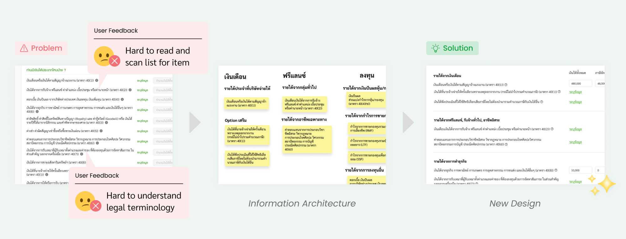
3. Can't select the correct income
There are 16 types of incomes that users have to select for their tax filing. Users have a hard time scan the list for their type of income. We reorganize the income types togther using information architect. We group income types together and give them proper group label.
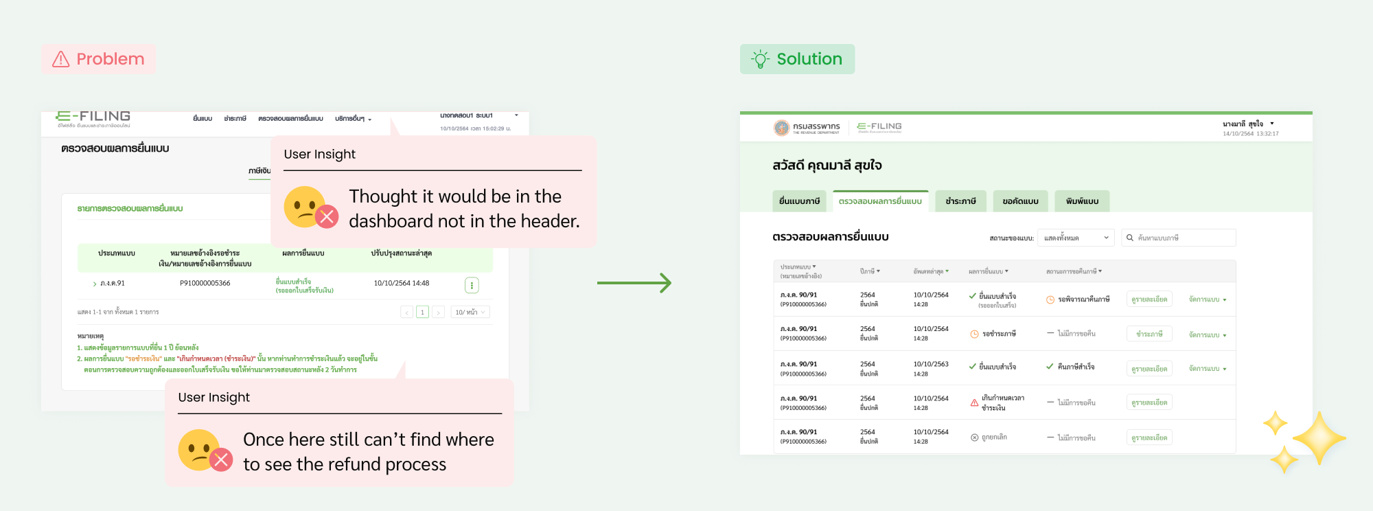
4. Can’t find tax refund status
Almost all users in from our usability testing sessions could not find where to their refund status are. This is because filing tax and tax refund are located in separated systems. They have to logout and login to another system to find their refund status. This problem can’t simply be fixed with UI. Thai Revenue Department need to combine two systems together to create a seemless experience.
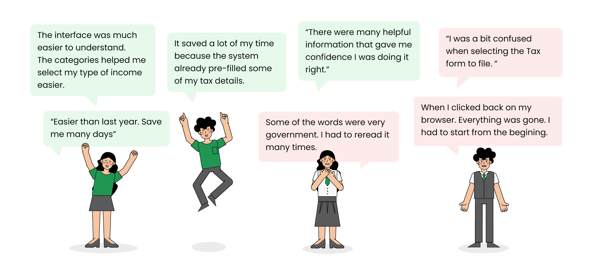
Feedbacks After Launched
A majority of our design suggestions based on the usability issues we observed were implemented, however, there were also some that weren’t implemented in time for the Tax 2021.
Related Case Study
VAT Registration for e-Services
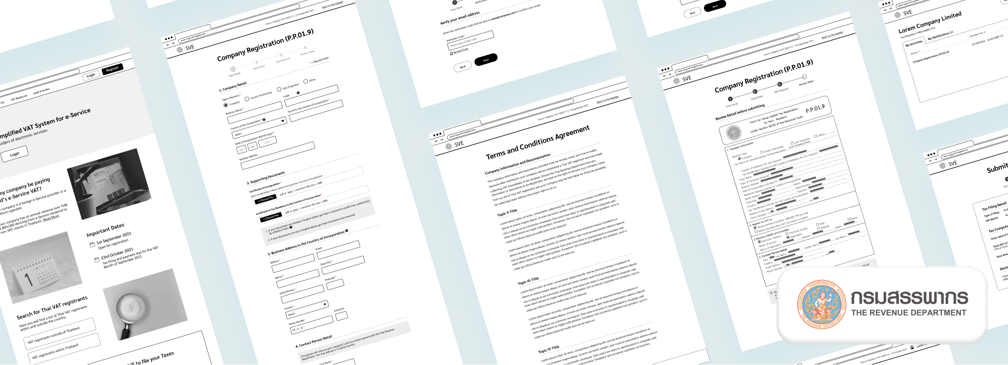
As of September 1st 2021, following in the footsteps of more than 60 countries around the globe, Thailand begun collecting value-added tax (VAT) from foreign e-service operators receiving income in from its country’s citizens. Prior to the policy launch date, the Thai Revenue Department approached us to help them find any usability issues that might exist so that the the tax managers at these foreign tech companies would be able to easily use the website to register their company successfully and conveniently. Read More
